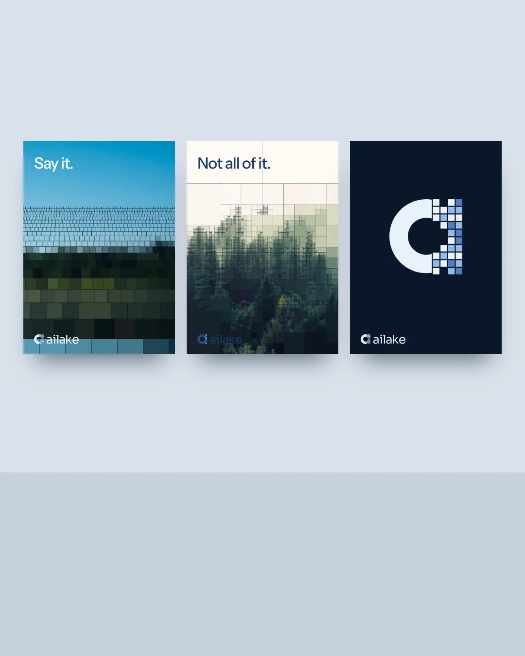
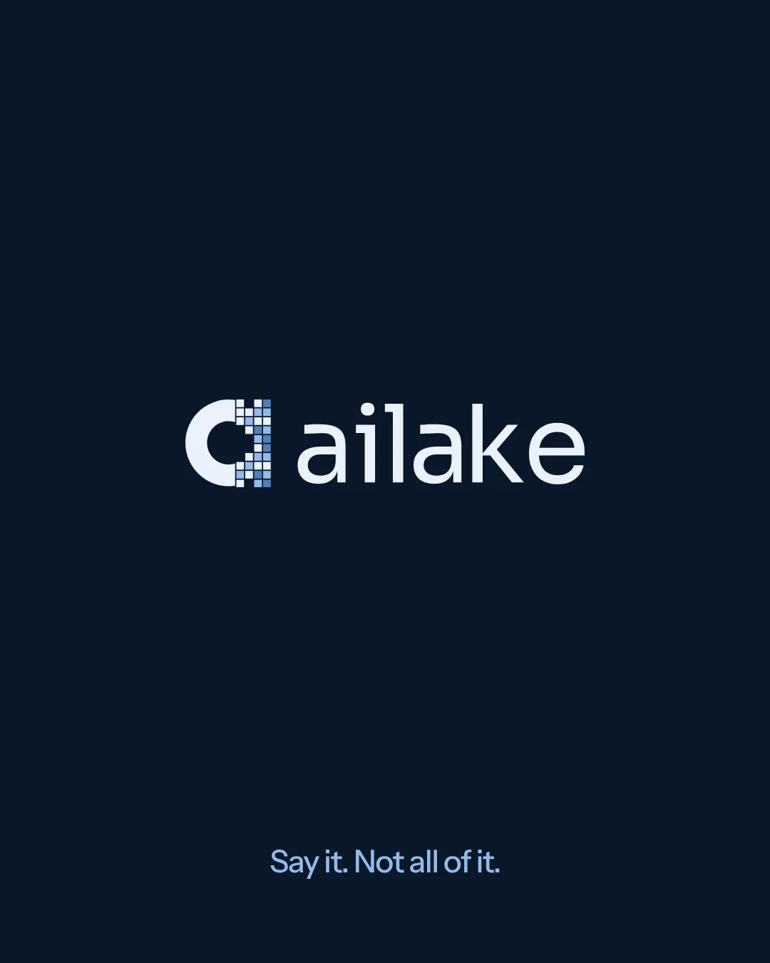
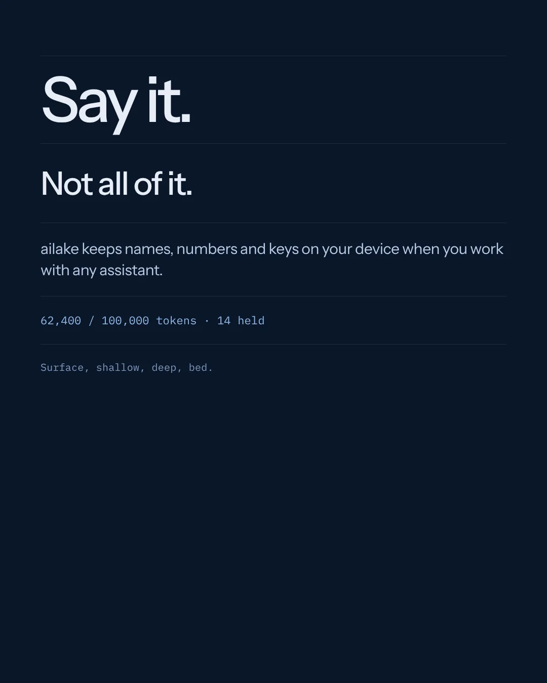
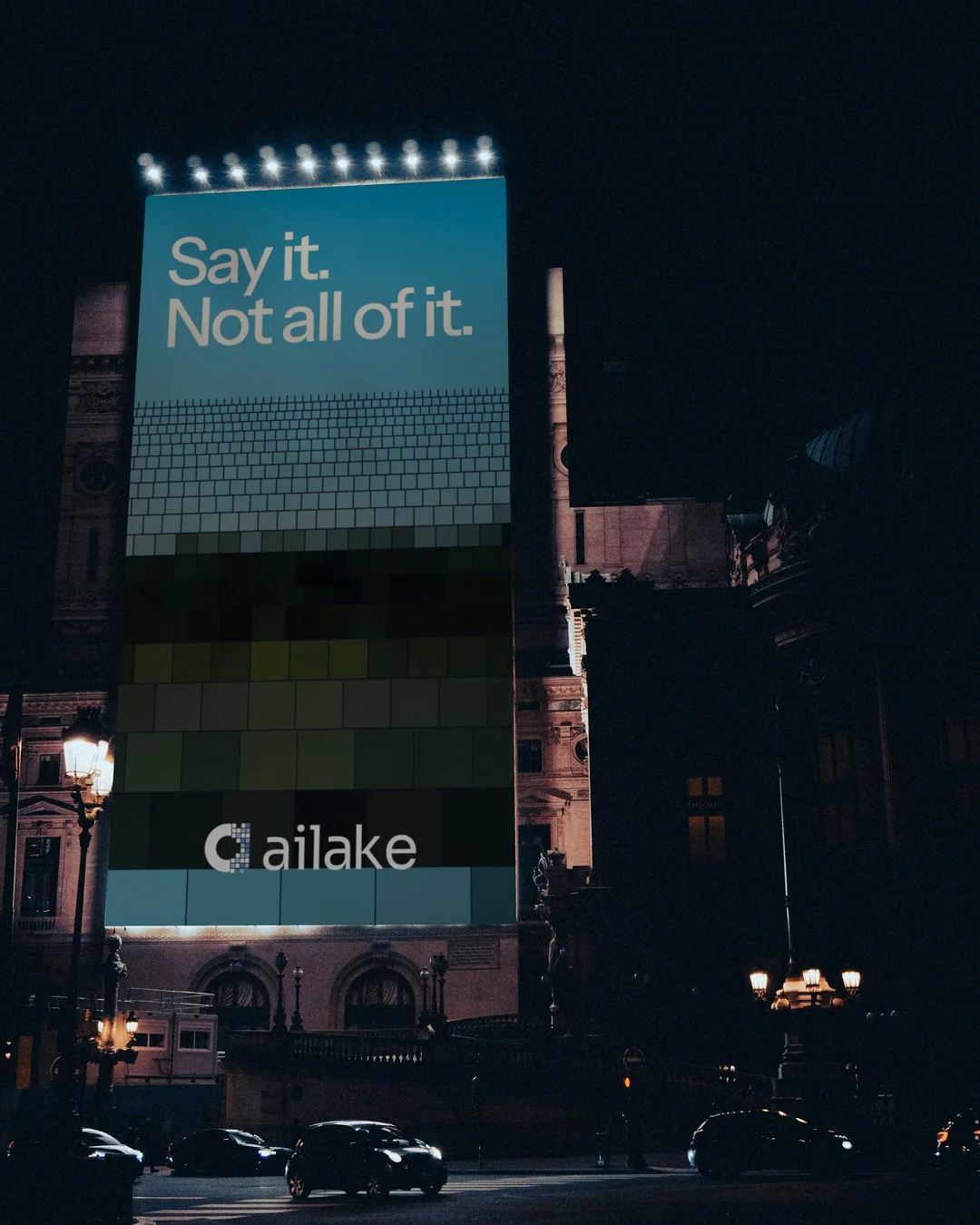
Say it.
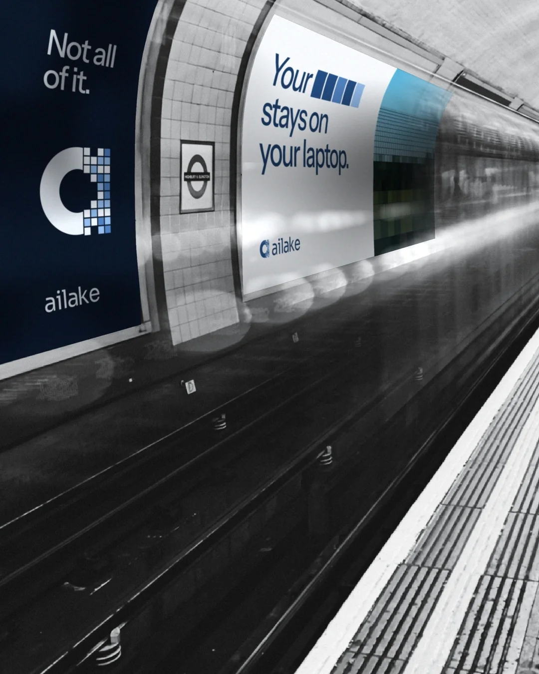
Not all of it.
A visual identity for the layer between you and AI. Open to possibility. Selective with information.
Explore the project ↓
Make an invisible
boundary visible.
AILake sits on a user’s computer between their workflow and AI providers. It is designed to keep sensitive information from reaching those providers, with controls for token consumption and usage across browser and app workflows.
The design challenge: express protection without making the brand feel closed. The answer is a system built around selective disclosure.
- Client
- AILake
- Discipline
- Brand identity
Visual language
Motion & digital applications - Studio
- NOK Studio
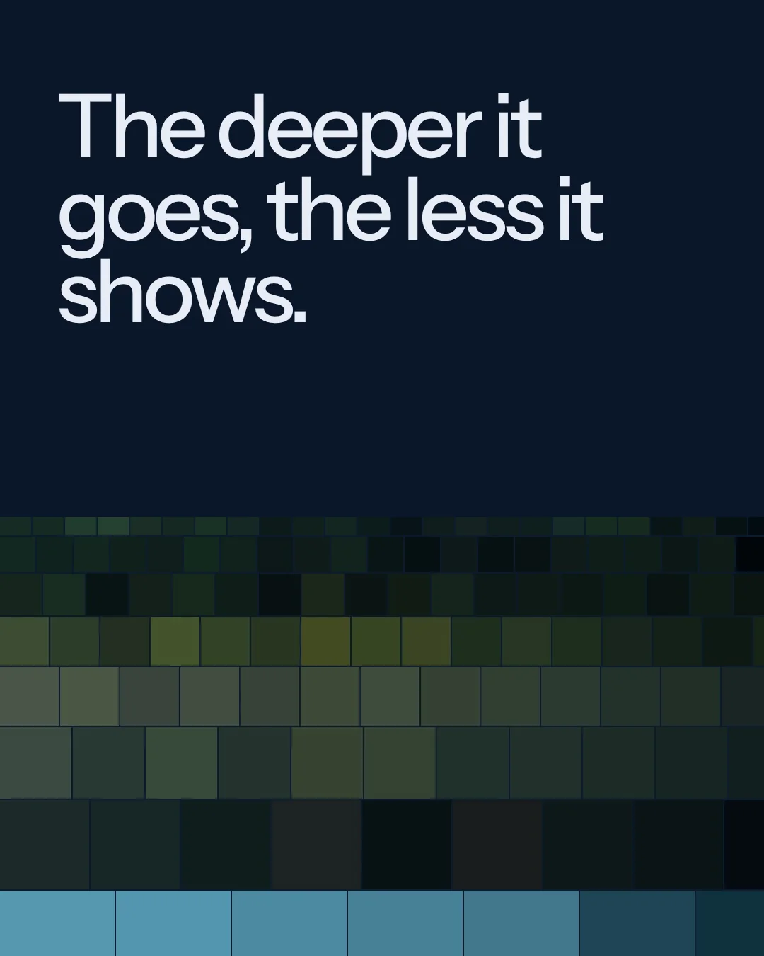
The deeper it goes, the less it shows.
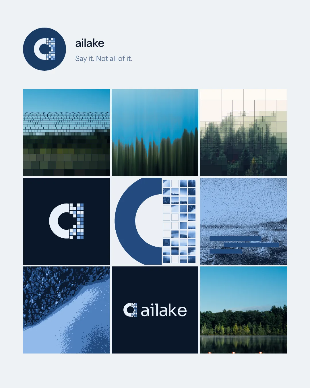
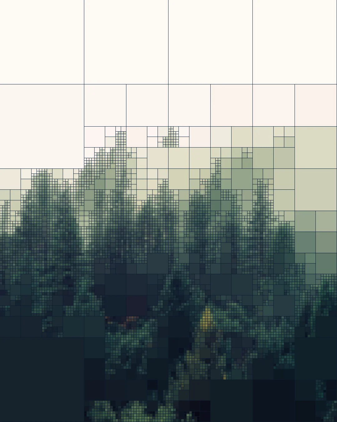
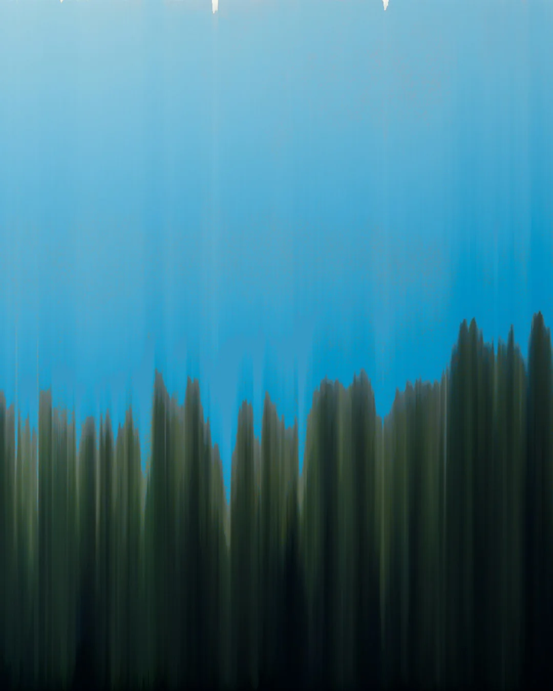
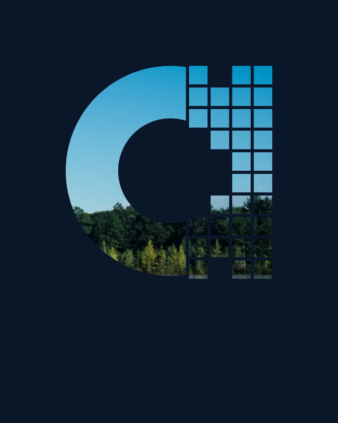
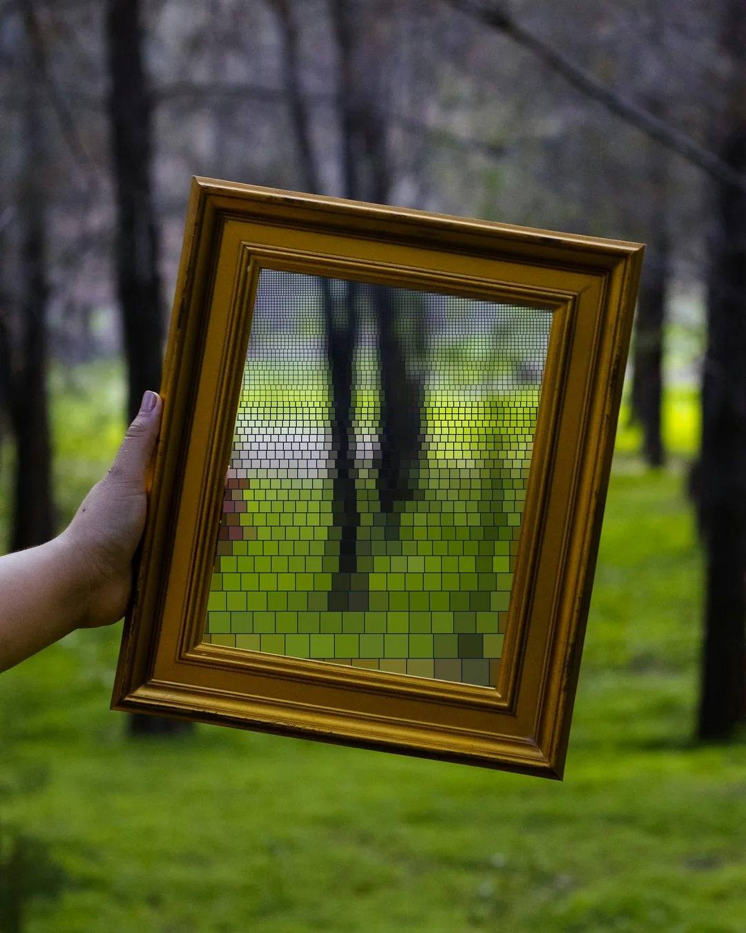
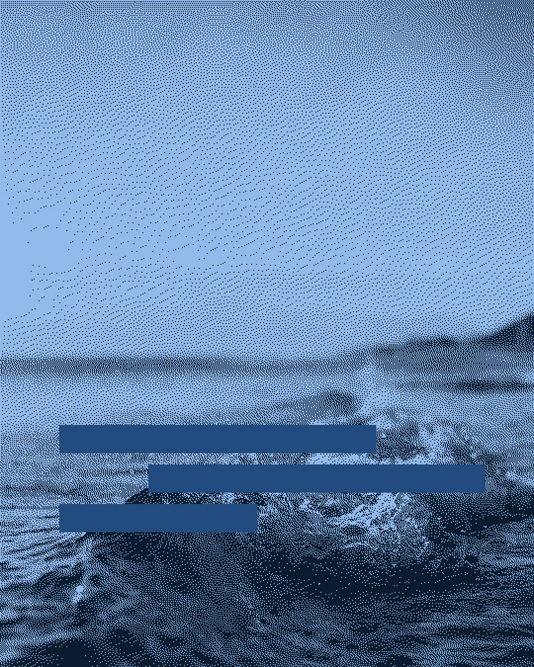
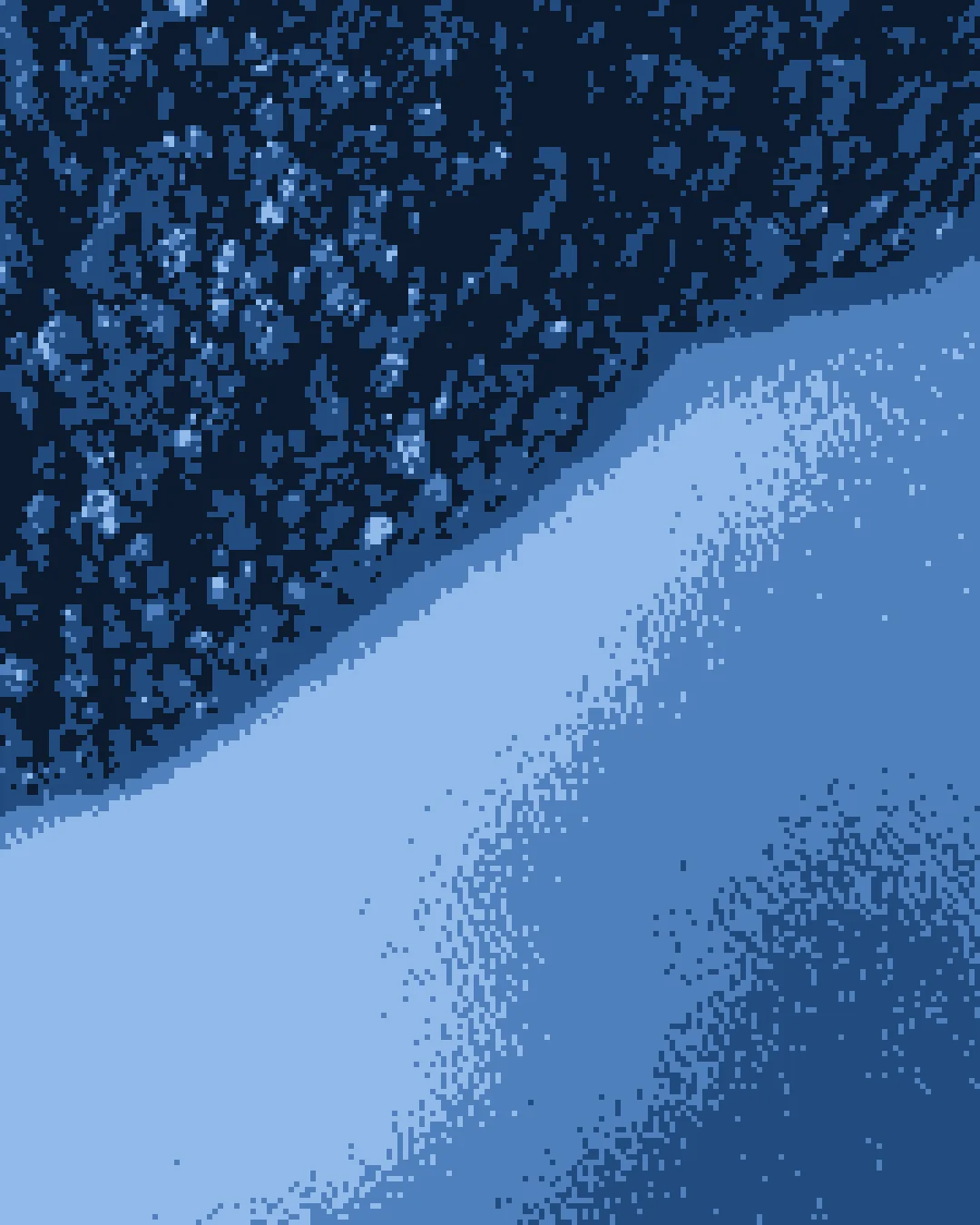
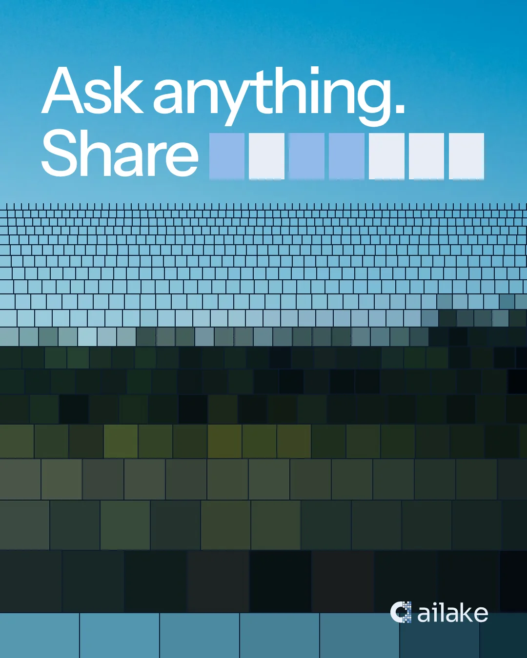
A lake reveals its surface and conceals its depth. We translated that relationship into an image language: familiar scenes become less detailed as they move through layers of pixels. Information remains present, while its specifics become unreadable.

A continuous form. A selective edge.
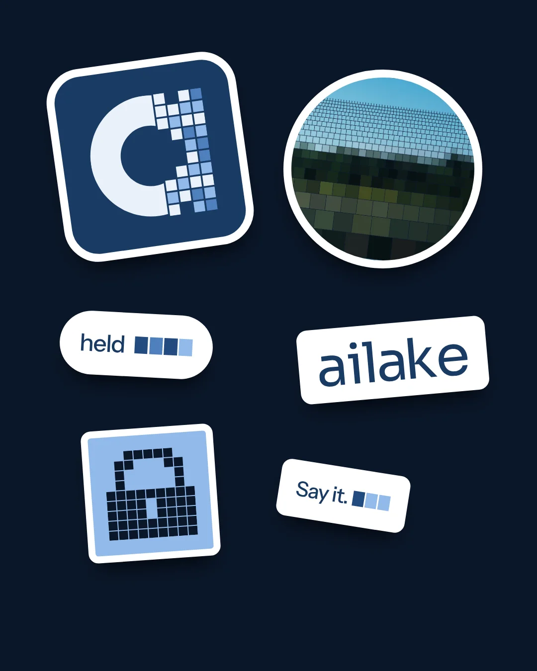
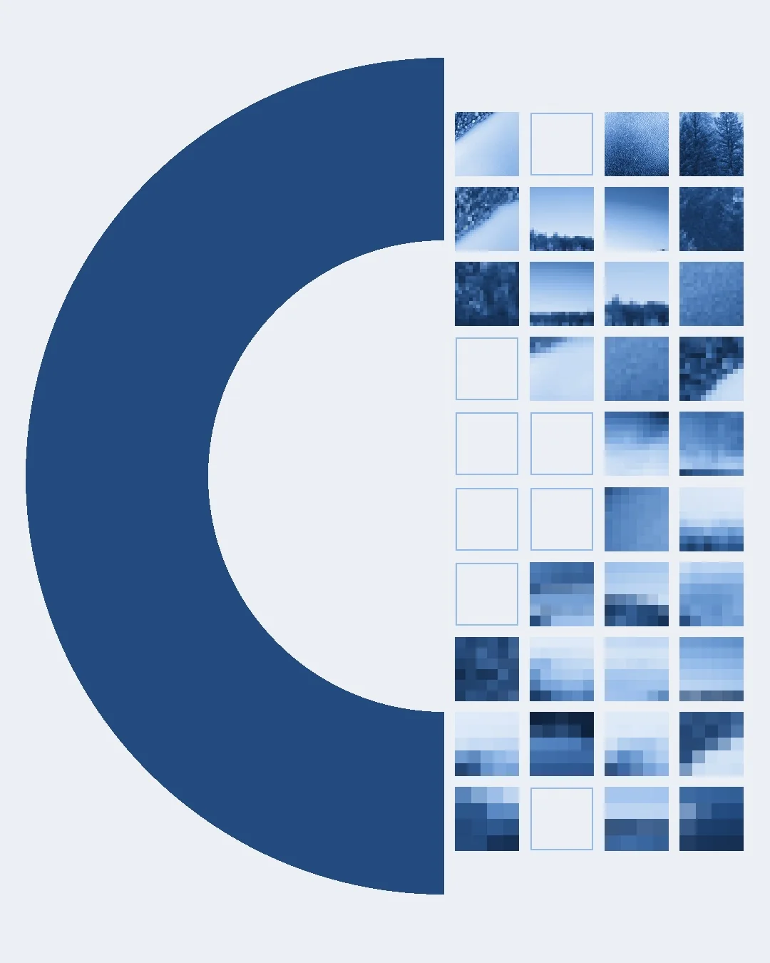
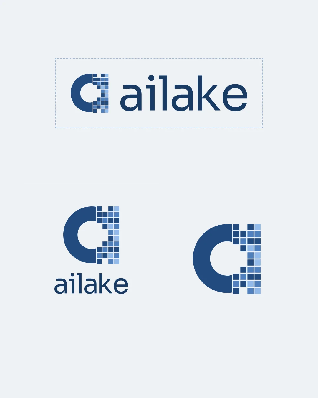
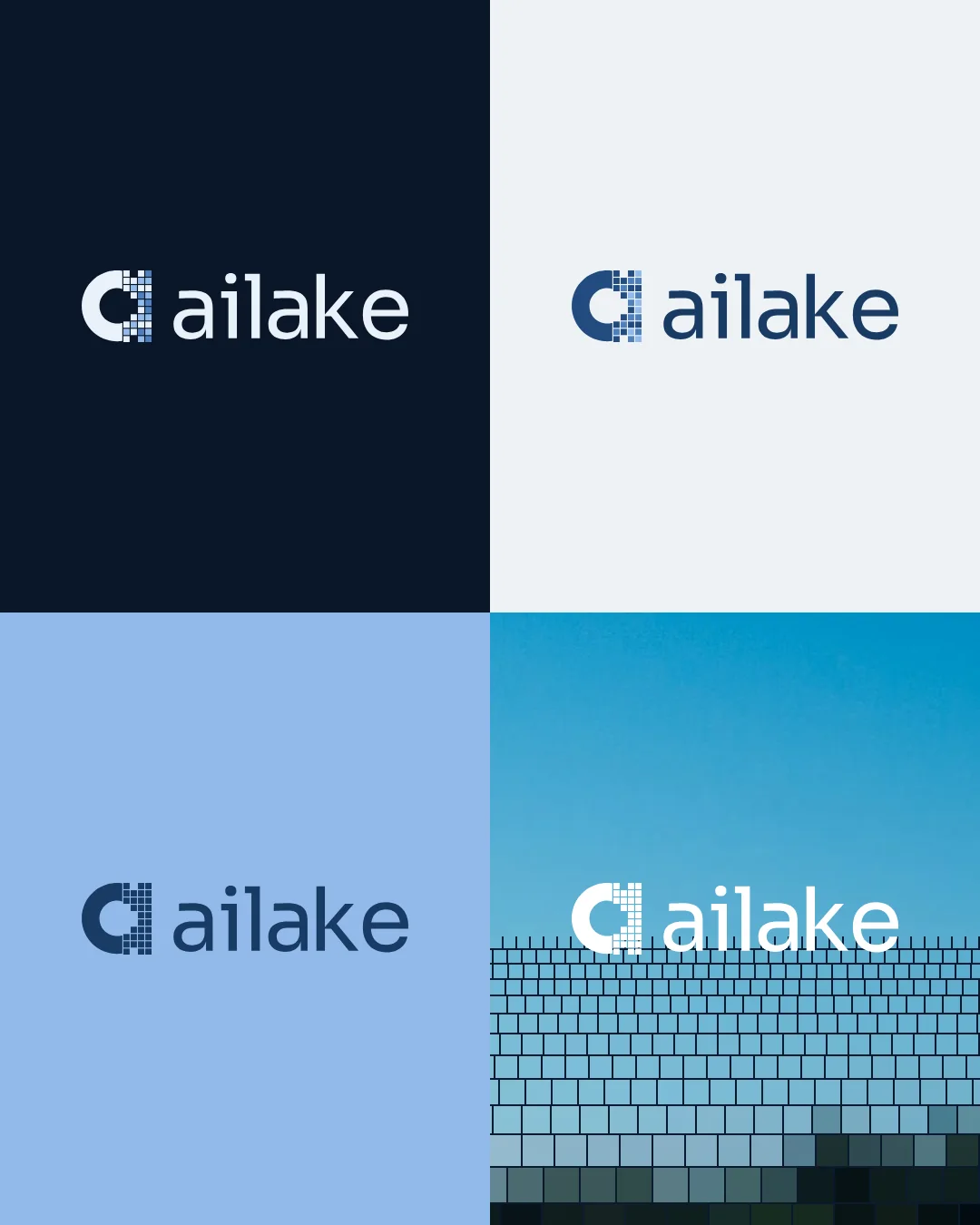
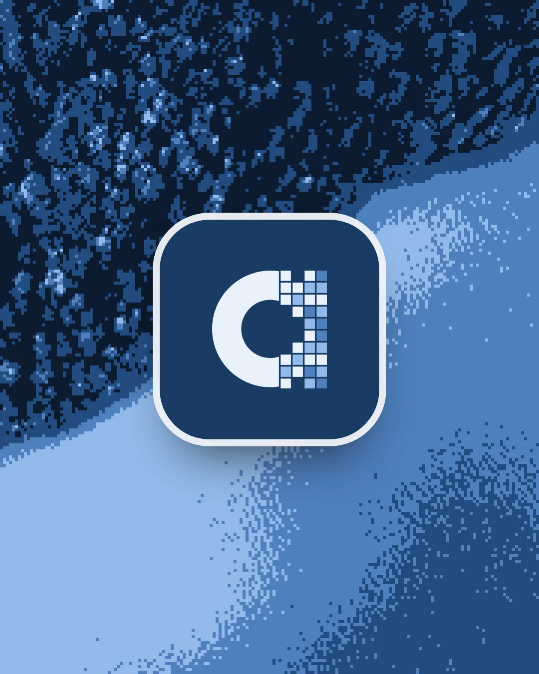
The symbol pairs a curved, continuous body with an open grid. One side holds; the other filters. The same structure becomes a window, an image archive and a recognisable mark at small sizes.
From a single mark to a shared language.
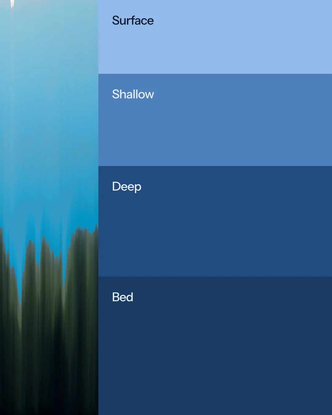
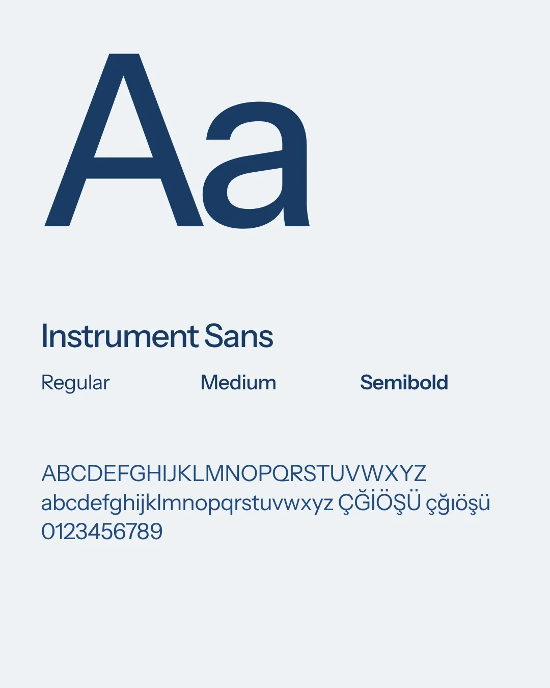
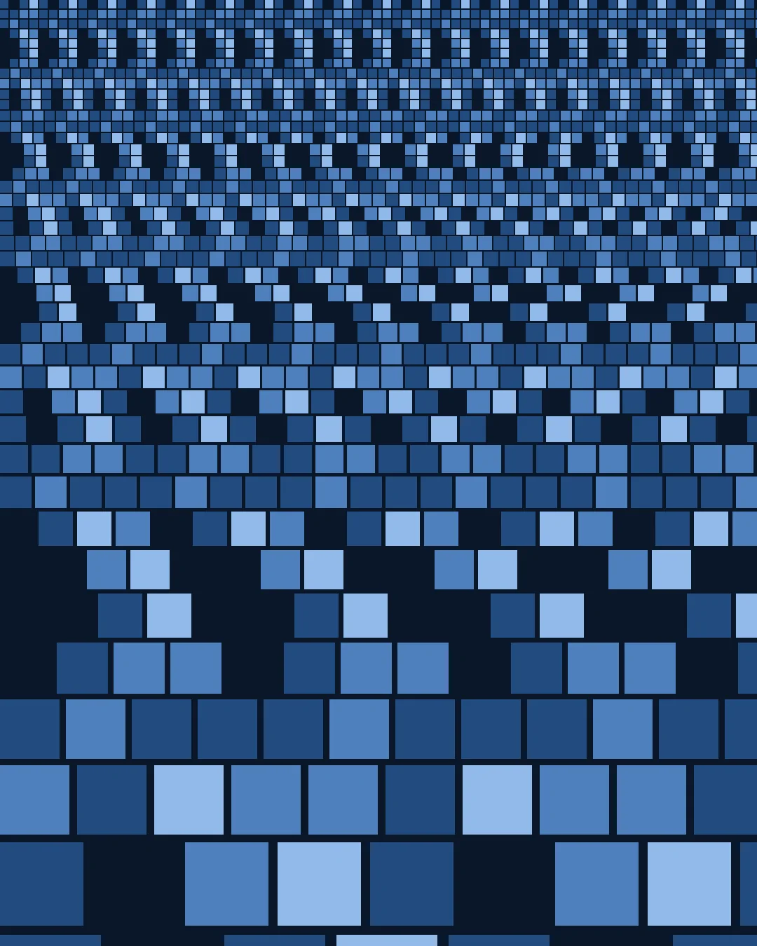
Four lake-inspired blues, Instrument Sans and a modular pixel grid give the identity a consistent foundation. The grid scales from a favicon to patterns and pictograms; photography brings depth and texture to the precise geometry.

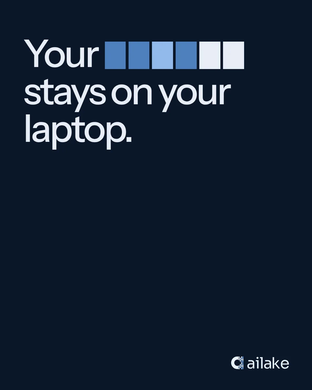
The missing words carry the message.
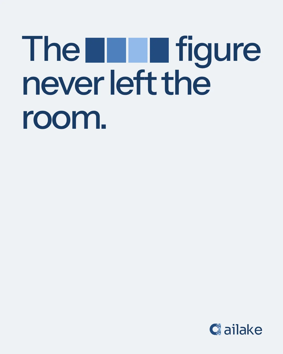
Redaction becomes the voice of the brand. Each headline makes its point by withholding a detail, turning the product’s purpose into a simple, visible gesture. The language carries across posters, outdoor placements and social formats.

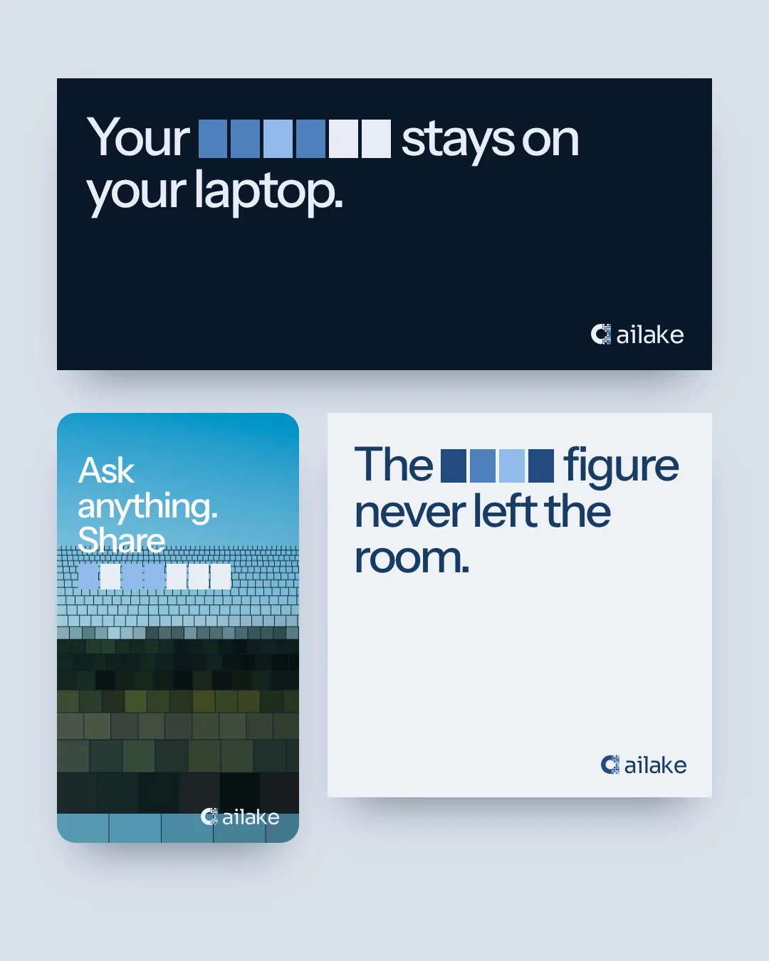
Protection, made understandable.
The digital applications bring the identity closer to everyday use. A website introduces the promise; browser, menu bar and reporting concepts make protected values and usage visible. The same visual language connects the story to the interface.
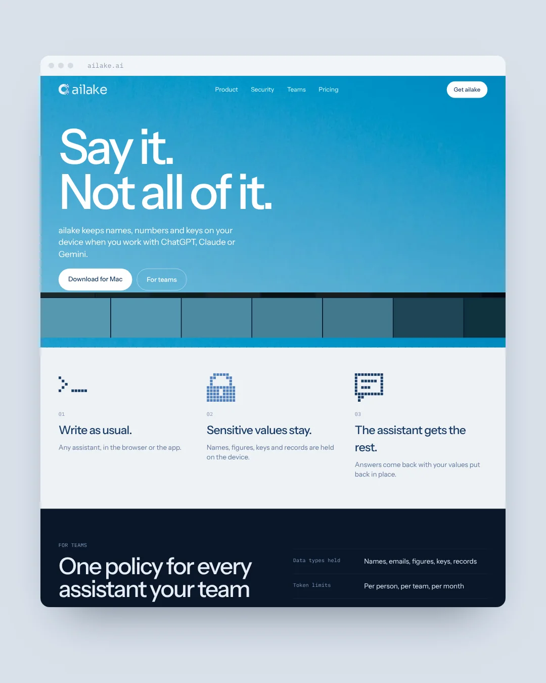
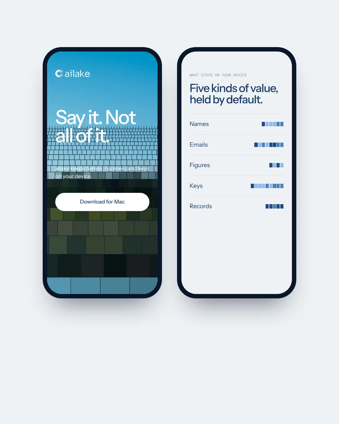
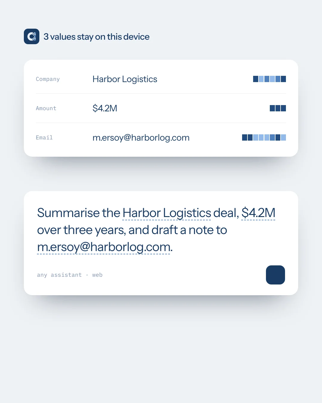
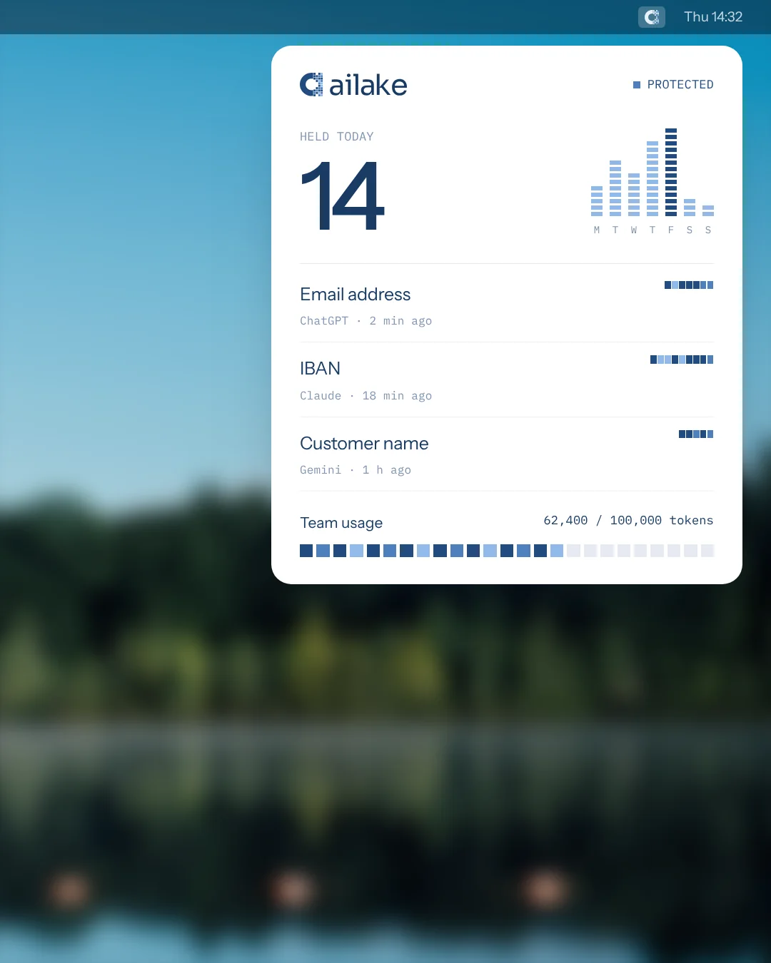
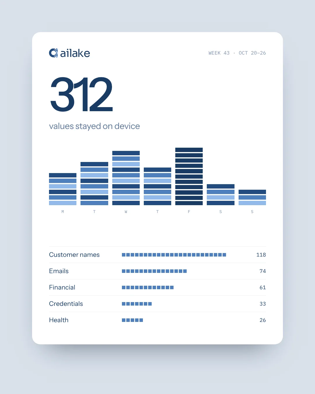
Product screens are illustrative design applications. Names, figures and domains shown are placeholders.
A system that travels.
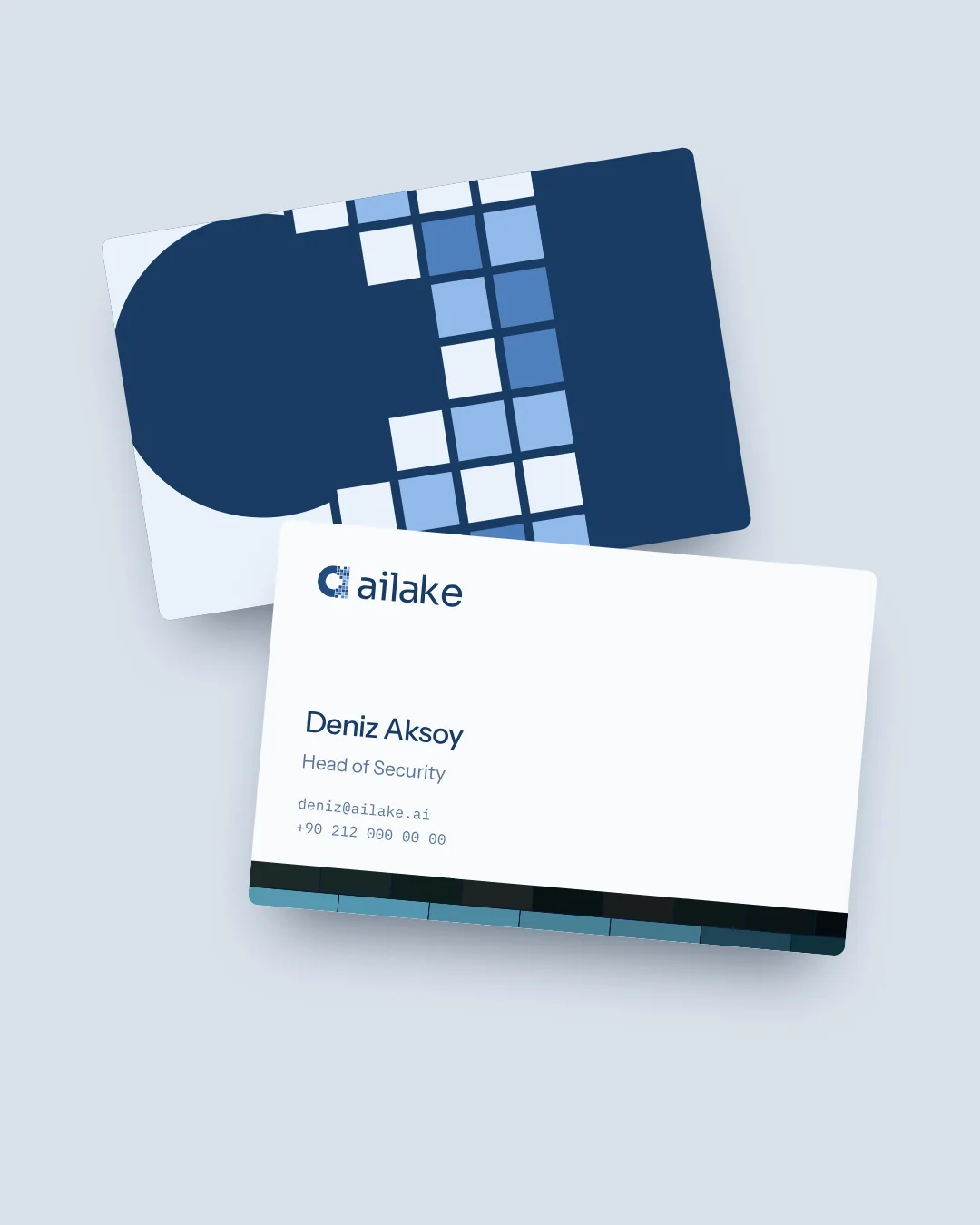
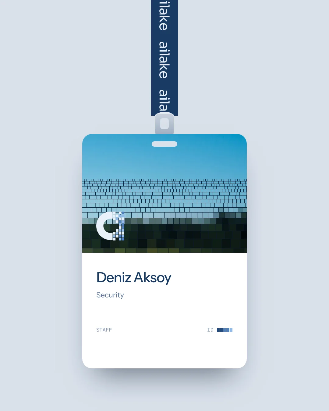
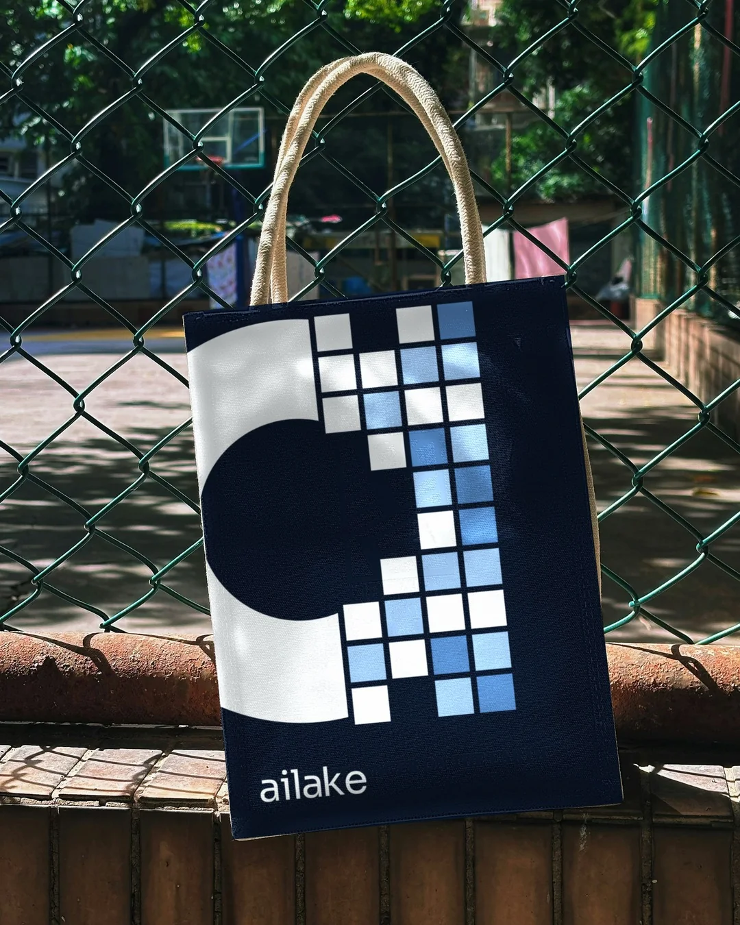
Across stationery, objects and social content, the identity keeps the same balance: calm colour, direct language and a distinctive pixel edge. Different formats, one recognisable idea.